Art frames are more than just protective borders for your artwork. They add personality and style to any room. Choosing the right art frame can enhance your home decor dramatically. It's an exciting way to showcase your personal taste. With trends constantly evolving, staying updated is essential for creating a unique setup.
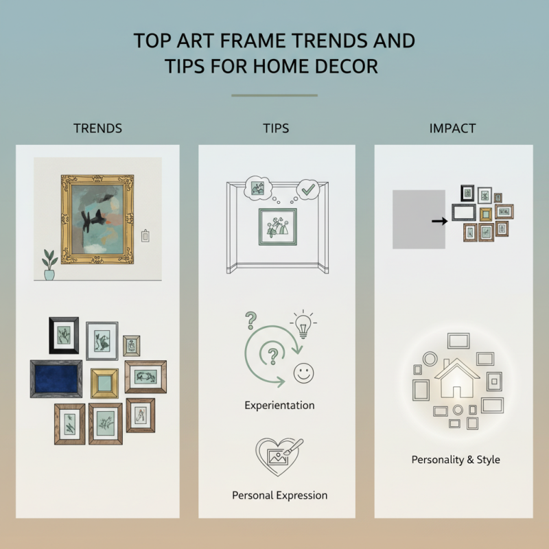
Incorporating different styles of art frames can transform plain walls into stunning exhibits. Consider using oversized frames to create a focal point. A gallery wall with varying frame styles can bring vibrancy to your space. Mixing colors and materials opens up endless possibilities.
However, it’s crucial to reflect on the overall harmony of your decor. Not every art frame will complement your existing design. You might find yourself overwhelmed by choices. Experimentation may lead to unexpected outcomes. Embrace the imperfections as part of your creative journey. After all, home decor is a personal expression.
When it comes to modern home interiors, art frames play a crucial role. The right frame can elevate a simple piece of art into a stunning focal point. Current trends show a strong preference for minimalism. Clean lines and neutral colors dominate frame designs. Black, white, and natural wood are especially popular these days. They seamlessly blend with a variety of decor styles.
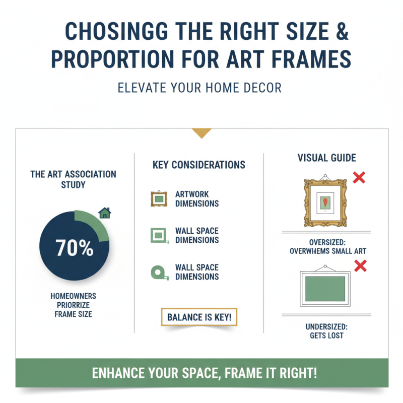
Mixing and matching frames is another trend. Gallery walls provide a chance to showcase diverse art pieces while maintaining a cohesive look. Experimenting with different sizes and shapes can feel daunting. It’s important to find balance amidst the chaos. Oversized frames might overwhelm a small space, while tiny ones can get lost on a large wall.
As people explore their personal style, they often stumble upon new ideas. Using vintage frames adds character and warmth, creating a unique touch. Conversely, sleek, metallic frames bring a contemporary flair. The choice is subjective. Comfort and aesthetic appeal should guide decisions. Too much uniformity can fall flat; embracing imperfections often leads to surprising results.
This chart illustrates the current popularity of various art frame styles in home decor for 2023. The data reflects consumer preferences and trends in interior design.
Choosing the right size and proportion for art frames can drastically enhance your home decor. According to a recent study by the Art Association, nearly 70% of homeowners prioritize frame size when curating their wall art. Selecting a suitable frame means understanding the dimensions of both the artwork and the wall space. An oversized frame can overwhelm a small piece, while an undersized one might get lost.
Tips: Measure your artwork accurately. Take into account the wall height, width, and existing decor. Use painter’s tape to outline frame dimensions. This gives a visual idea of how it will look. A common rule suggests leaving a margin of 6 to 12 inches between the artwork and surrounding decor.
Proportion is another vital aspect. A framed piece should harmonize with furniture and other elements. For instance, large bold art works well above a big couch. In contrast, smaller pieces can create a gallery wall effect. However, many people overlook this. They often choose frames based on personal preference rather than cohesive design. Strive for balance in your choices, yet don't be afraid to express individuality.
Mixing and matching frames can transform your home decor. It adds character and showcases your unique style. For a cohesive look, stick to a color palette. Black, white, and natural wood tones are versatile options. Each frame can vary in size. Play with shapes too—round, square, or ornate. The diversity adds visual interest.
Don’t be afraid to include mismatched styles. A vintage frame can pair well with a modern piece. It creates a playful tension. You might find that certain combinations work better than others. Experiment with various arrangements on the floor before committing to hanging them. This trial and error process may reveal surprising favorites.
Consider layering smaller frames over larger ones. It can create a focal point on your wall. Using different materials, such as metal and wood, can enhance texture. Be cautious; too many contrasting elements may feel chaotic. Aim for a balance that feels organic. Reflect on how each frame interacts with its surroundings. This intentionality will elevate your decor.
Color and texture play crucial roles in selecting art frames for home decor. A well-chosen frame enhances the artwork while complementing the surrounding environment. According to a report by the Interior Design Society, 78% of consumers prioritize color coordination in their decor choices. This shows how a harmonious palette can transform a space.
Texture can make a big impact, too. Rough wood frames can add warmth, while sleek metal frames introduce modernity. A 2021 study highlighted that texture influences mood. For instance, soft textures create a sense of calm, while bold textures energize a room. Consider pairing a textured frame with a contrasting artwork to make it pop.
Yet, not all color combinations work. A poorly matched frame can detract from the artwork's appeal. Many find themselves overthinking choices. Don't hesitate to experiment. Ultimately, it's about creating a personal expression. Keeping flexibility in design choices encourages creativity. Balancing color and texture with personal taste is essential for an inviting atmosphere.
| Trend | Description | Color Palette | Texture |
|---|---|---|---|
| Minimalist Frames | Sleek and simple designs that enhance artwork without overshadowing it. | Neutral tones - whites, blacks, and wood finishes | Smooth finishes with matte or satin textures |
| Bold Colors | Frames that feature vibrant colors to add personality and energy to spaces. | Bright colors - red, blue, green, yellow | Glossy or textured finishes |
| Eclectic Mix | Combining different frame styles and colors to create a unique gallery wall. | Varied palette - mix of warm and cool tones | Varied textures - metallics, wood, fabric |
| Natural Materials | Frames made from wood, bamboo, or other eco-friendly materials. | Earthy tones - browns, greens, beiges | Raw or distressed finishes |
| Textured Frames | Frames that incorporate texture to add depth and interest. | Soft pastels or monochrome | Rugged, fabric, or embossed textures |
When displaying art frames in your home, placement plays a crucial role. According to a report by the National Endowment for the Arts, nearly 60% of people feel that art enhances their living spaces. The visual impact can shape the ambiance of a room. Ensure your art is at eye level. This is typically around 57-60 inches from the floor. It invites a natural gaze and appreciation of the piece.
Mixing frame styles can add depth. You might consider using various textures and colors. This can create a dynamic composition, making the art stand out. Aim for a balance between large and small pieces. Grouping them together creates a cohesive look. A well-thought-out gallery wall often resonates with viewers.
Remember to create sufficient space between frames. Ideally, two to three inches should be kept between each piece. Too close can feel cramped. Stepping back to evaluate the arrangement is essential. Sometimes, what looks good up close may not work from a distance. Be willing to adjust until it feels right. Your walls are a canvas too.
